Celebrating Berlin’s Typography, Before It Vanishes
A tour of the city’s most striking signs.

Jesse Simon was walking around Berlin’s Lichtenrade district one summer evening in 2016 when he had a epiphany. He’d done a lot of exploring since he’d arrived in the city four years earlier. He’d wandered through different neighborhoods and, as a former graphic designer, had noticed signs across the city: street signs, signs for public transport, storefronts. He’d even been thinking about writing a book on how Berlin’s typography contributed to its visual identity. And then he strolled past a seemingly innocuous brick-fronted store.
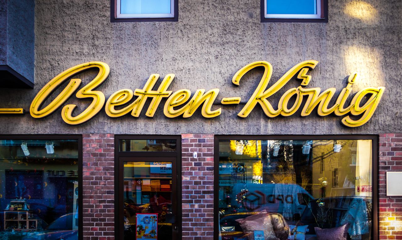
“I came across a sign for a shop called Betten-König, an exquisite, yellow, cursive neon sign attached to the façade of what otherwise looked to be a fairly modest shop,” Simon recalls. “Something snapped into focus.” He realized that he’d been thinking about Berlin’s civic and commercial signs only in terms of their function. And yet, “this Betten-König sign, which seemed somehow too grand and too glorious for its purpose, was doing something entirely different. It brought a kind of joyous irreverence to the street,” he says.
This realization led Simon to launch Berlin Typography, a project that documents his city’s typographic glories. “There were dozens, perhaps hundreds of similarly wonderful signs—highly individual, sometimes deeply quirky, often strikingly beautiful—scattered throughout the city. I had walked past them countless times, but had never registered quite how much they contributed to the character of the street and the city.”
There was another motivation for the project, too. Berlin currently has the fastest-growing property market in the world. Its economy is thriving, and as a city rapidly changes, so too do its signs. To Simon, Berlin’s signs “offered a direct line to a different city, a version of Berlin that had once existed but had now almost completely vanished. I felt the need to start documenting these artifacts before it was too late.”
He began to explore Berlin anew, this time armed with a camera. “Since then I’ve been trying to cover as much of the city as possible, and the more places I visit, the more I begin to understand the patterns and themes that give Berlin’s typography its own particular character.”
Simon now has, he estimates, around 3,500 photos of Berlin’s civic and commercial signs, and there is still much to document. “Instead of writing a book I ended up taking a bunch of pictures, which, in terms of writing, is an impressive feat of procrastination,” he says. “But the text will come eventually. In the meantime, there are the images, which I hope convey something of the joys and delights of Berlin’s typographic legacy.”
Atlas Obscura spoke to Simon about typographic patterns, the difference in sign styles between the former East Berlin and the former West Berlin, and how the city’s booming property market is altering its visual landscape. You can see more of Berlin Typography on Twitter or Instagram.
What patterns do you notice in terms of typography in Berlin? For example, do certain businesses use similar styles or color schemes?
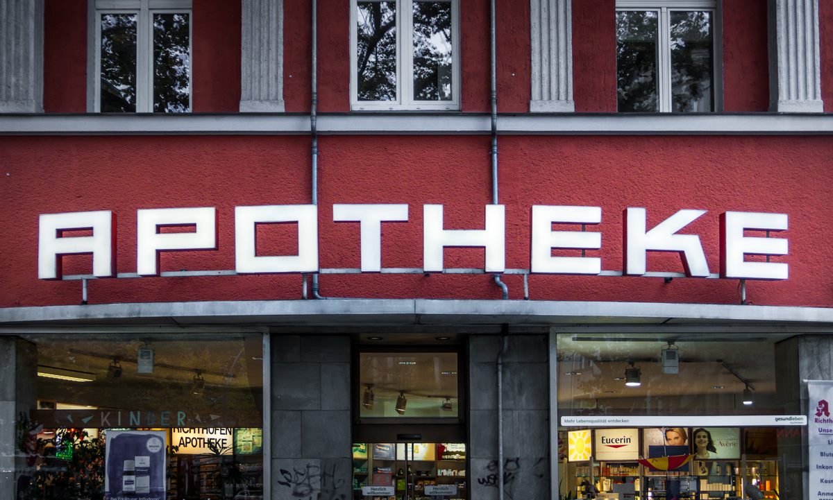
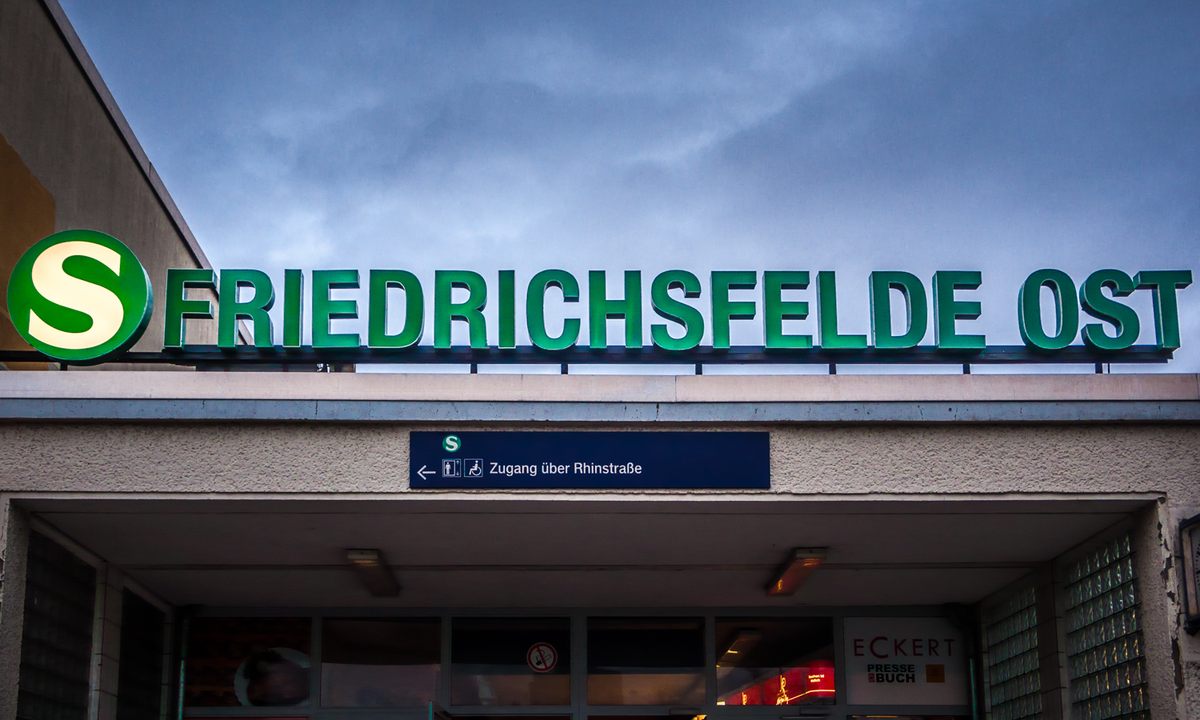
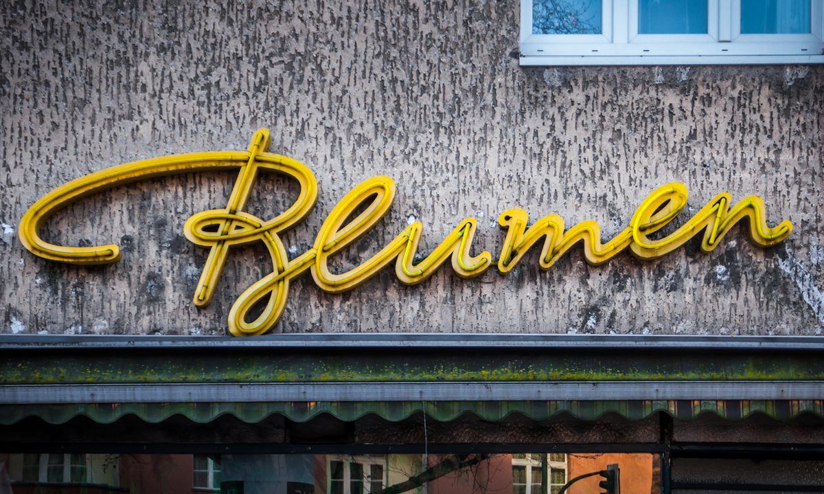
There are definitely trends visible throughout the city. Perhaps the most obvious is color: Apothekes [pharmacists] tend to have red signs (which, itself, differs from much of the rest of Western Europe, which favors green), as do butcher shops. Florists tend to be green and bakeries will often be yellow. But these are just rough guidelines, and there are always exceptions.
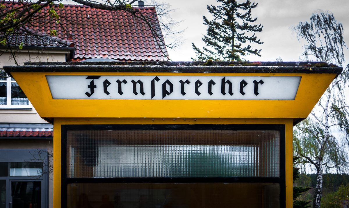
Something else one finds in Berlin (and in most larger German cities) is a kind of creative tension between Western European and traditional German approaches to typography. Although German uses the Latin alphabet now almost exclusively, blackletter or Fraktur scripts were dominant in the previous centuries, and the influence is still present today. German also has its own orthographic traditions and its particular variations on the Latin alphabet, specifically the umlauted letters and the Eszett (ß). Again, this is not unique to Berlin, but is definitely a part of what makes its urban typography so distinctive.
There is also a set of typographic styles and approaches that, if not necessarily unique to Berlin, have been adopted here in a fairly idiomatic way. Cursive scripts, especially, seem to be a recurring element of Berlin’s typographic spirit. They appear painted onto glass, bent from neon tubes, and printed onto light boxes. They come in and out of fashion, but never quite disappear.
It should also be mentioned that, while Berlin has been a unified city for more than a quarter-century now, there is still a pronounced difference in typography between the former East and the former West. Probably about 90 percent of the signs in the Berlin Typography archive are from the former West. Of course the East, when it existed, had elaborate cursive neon to rival the best in the world, but after reunification it vanished quickly. Today, if you walk through the neighborhoods of the former East, it’s astonishing how little DDR-era typography remains. It would appear that, in the aftermath of what was essentially a regime change, the East was keen to divest itself of all obvious visual connections to the past.
What do you know about the materials used for signs in Berlin, and do certain styles lend themselves to particular materials?
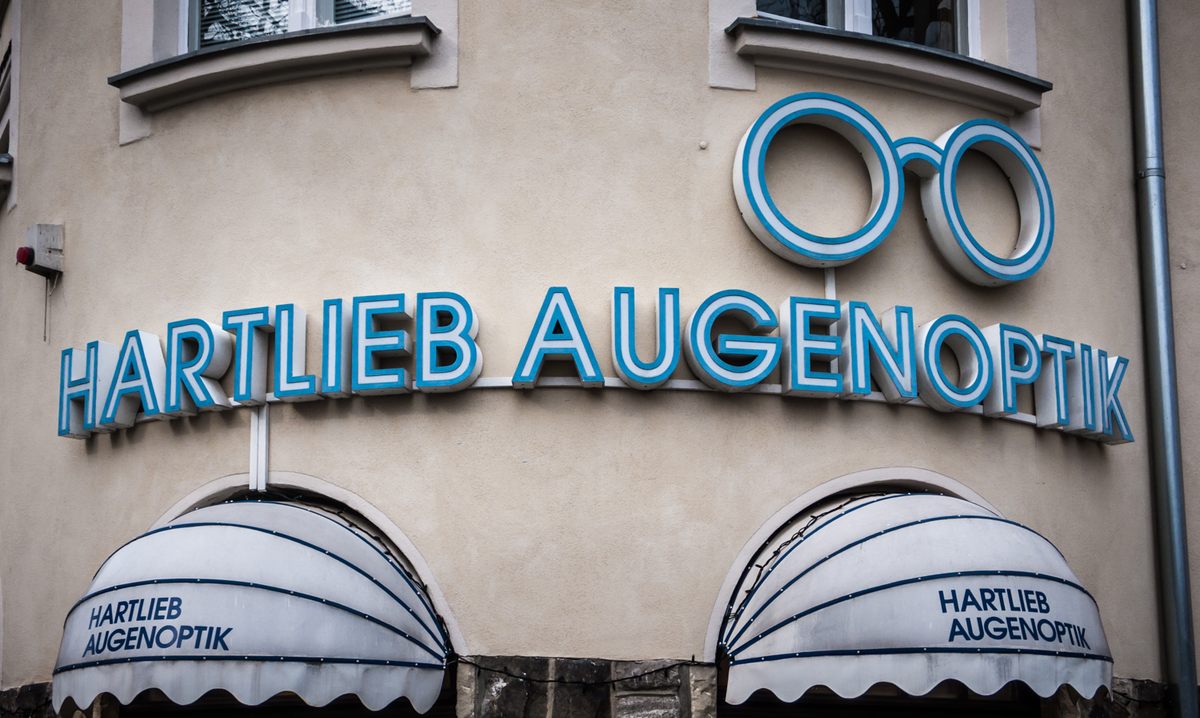
Pretty much any material that can be turned into letters has been turned into letters in Berlin. Carved stone, sometimes with gilded letters, was common in commercial buildings at the end of the 19th century. Painted glass was everywhere for a few decades during the first half of the 20th. Stylish neon was common throughout Europe from the ’50s onward. Right now, people are busy testing the boundaries of the LED, which is bound to result in some aesthetic disasters as well as some interesting new directions.
With Berlin’s current property market, is the city’s historical typography under threat, from construction or renovation?
Absolutely. The old Berlin typography is disappearing at an alarming rate. To give you an example, this very afternoon I walked past a building in my neighborhood that used to have an old insurance company sign… today there was nothing but new stucco and fresh grey paint. It’s amazing how many signs have disappeared even in the two years since the Berlin Typography project started. And the pace seems to be increasing. There have been moments when this project feels like a race against time.
Certainly the economic changes in the city are partially responsible. When old buildings are refurbished, outmoded signs are usually the first thing to go. But sadly, I think a lot of it is simply a matter of taste. If you’re a hair salon or a cafe, you probably want to look up-to-the-minute, which might mean replacing the old broken hulk of a neon sign with something more modern (if typographically less interesting). The fortunate signs find their way into the collection of the Buchstabenmuseum, a museum in Berlin dedicated to the preservation of old urban typography, and sometimes individual letters will show up for sale at flea markets and vintage furniture shops, but a lot simply disappear.
Again, I don’t want to fetishize the past. If cities didn’t change they’d be terribly boring. On the one hand, it’s easy to get dispirited by what’s happening in Berlin. Blocks of luxury flats are sprouting in vacant lots, crumbling old buildings are being spruced up and rent-controlled tenants ushered out, scary smoke-filled pubs are being turned into indie cupcake shops, indie cupcake shops are closing due to an unsustainable business model, working-class and immigrant populations are being pushed out as neighborhoods become filled with a newer, younger middle-class, and the florists, chemists, butchers, and bakers with the grand old neon signs are retiring and taking their shops with them. As the traces of the past city disappear, the ‘soul’ of the city begins to change.
But to put a positive spin on it, what’s happening here is exactly what’s been happening in New York or London or Paris for the past 20 years. In those cities the process is already far more advanced. Because of Berlin’s unique history in the 20th century, it’s still lagging behind the other capitals, and the pace of change is perhaps that much slower. In a way it is sad that the old typography is disappearing, but it’s also inevitable. The goal of the Berlin Typography project is not to lament a vanishing city, but to celebrate the ways that good typography can make our experience of a city that much more inspiring.
Can you share with us a couple of your favorite examples of typography in Berlin?
Betten-König. This is, in some ways, the sign that started the project and still one of my favorites. I have no idea if the neon still works, but even unlit it is completely magnificent, with its elaborate B and its squiggle of an umlaut. The name Betten-König, translated literally, means ‘King of Beds’ or ‘Bed King,’ which is a great (if somewhat boastful) name for a shop… however I later discovered that König is actually the surname of the shop-owner. Believe it or not, this image has never been posted to the Twitter account or in the blog, but the capital B has been the Berlin Typography project avatar from day one.
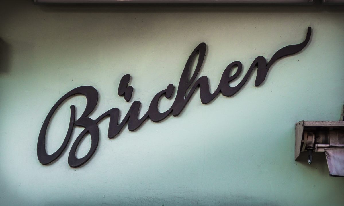
Bücher. One of the incidental pleasures of this project has been discovering the extraordinary variety of approaches to the umlaut. The three umlauted letters in the German alphabet–Ä, Ö, and Ü–each offer unique challenges to the type designer, and the number of solutions on display throughout the city is a source of inexhaustible delight. The lightning-stroke umlaut here is wonderful in its own right, and also seems the perfect complement to an example of Berlin cursive at its most elegant.
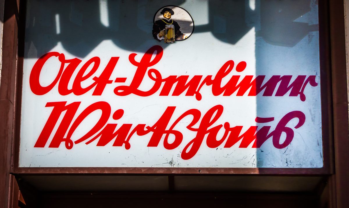
Alt-Berliner Wirtshaus. Sütterlin is a form of handwriting that was prevalent in Germany during the first half of the 20th century; it fell out of common use in the second half of the century but, as with Blackletter, is still used in signage to evoke the values of a previous age. The sign here reads ‘Alt-Berliner Wirtshaus’ although this is not immediately apparent. If you stare at it for long enough (or go to the Sütterlin Wikipedia page) it begins to make sense.
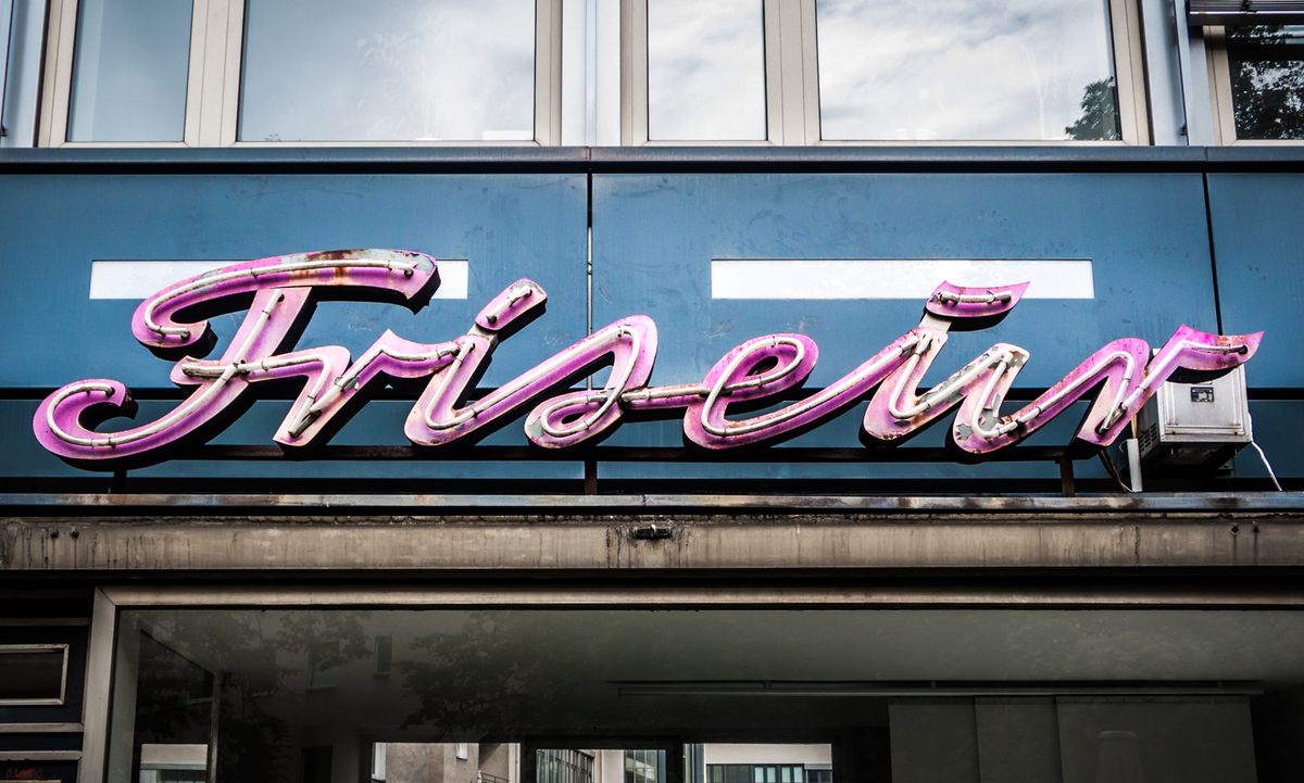
Friseur. I’m trying to put together a selection that reflects the material and typographic diversity of Berlin, but the temptation to send nothing but cursive neon is pretty strong. Cursive neon was everywhere from Los Angeles to Moscow in the ’50s, but it seems to have reached its limit of perfection in Berlin. I’ve included this one mostly because of the swoosh over the U, which is not an umlaut, but a typographical device designed to differentiate the lower-case ‘u’ from the ‘n’ which would otherwise be close to indistinguishable. As far as I’m aware, the convention was a holdover from Sütterlin, and while it seems unlikely that anyone would have accidentally misread such an obvious word, the swoosh is one of the orthographic conventions that gives German typography its distinctive character.
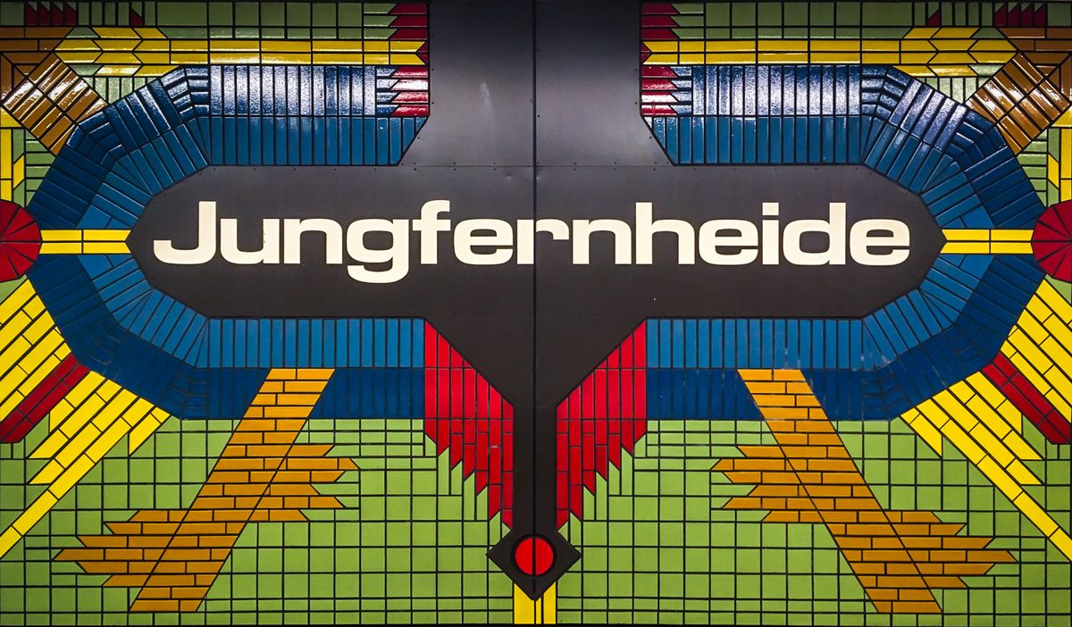
Jungfernheide. Typography, like music or clothing, looks amazingly cool when it’s new. Then it goes through a period of being less cool, followed by a period of being irredeemably uncool. The cooler it looked initially, the harder it tends to fall. Yet if it can survive this last, most brutal judgmental period, it often becomes cool again. Berlin’s public transit authority, BVG, is busy replacing the iconic typography of its ’70s and ’80s U-Bahn stations with something closer to corporate style. We can only hope that they come to their senses before they get to the Western end of the U7, which has come through to the other side of its uncool stage brilliantly intact.
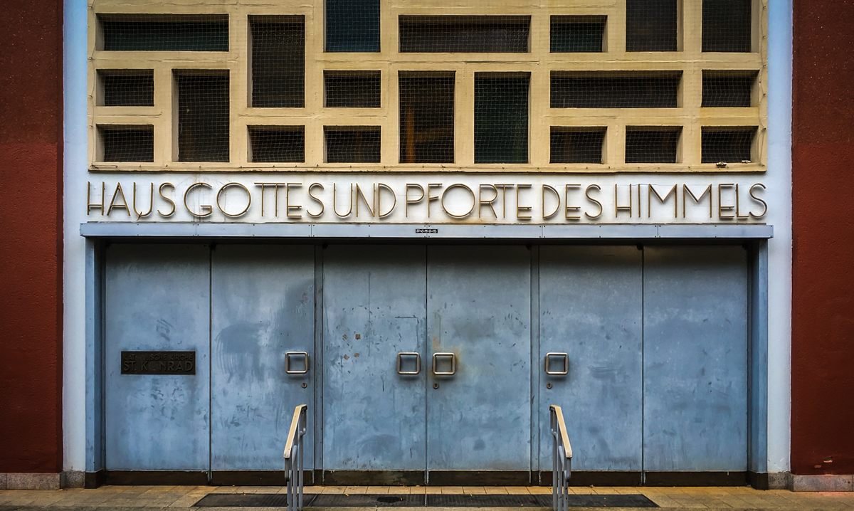
Haus Gottes. This quietly austere, post-war church somehow managed to hit the typography jackpot. The letters are formed of iron rods, and have a formal, geometric perfection that’s hard to miss. I was, indeed, so taken with this sign that I digitized the letters and used them as the typeface for the Berlin Typography logo.
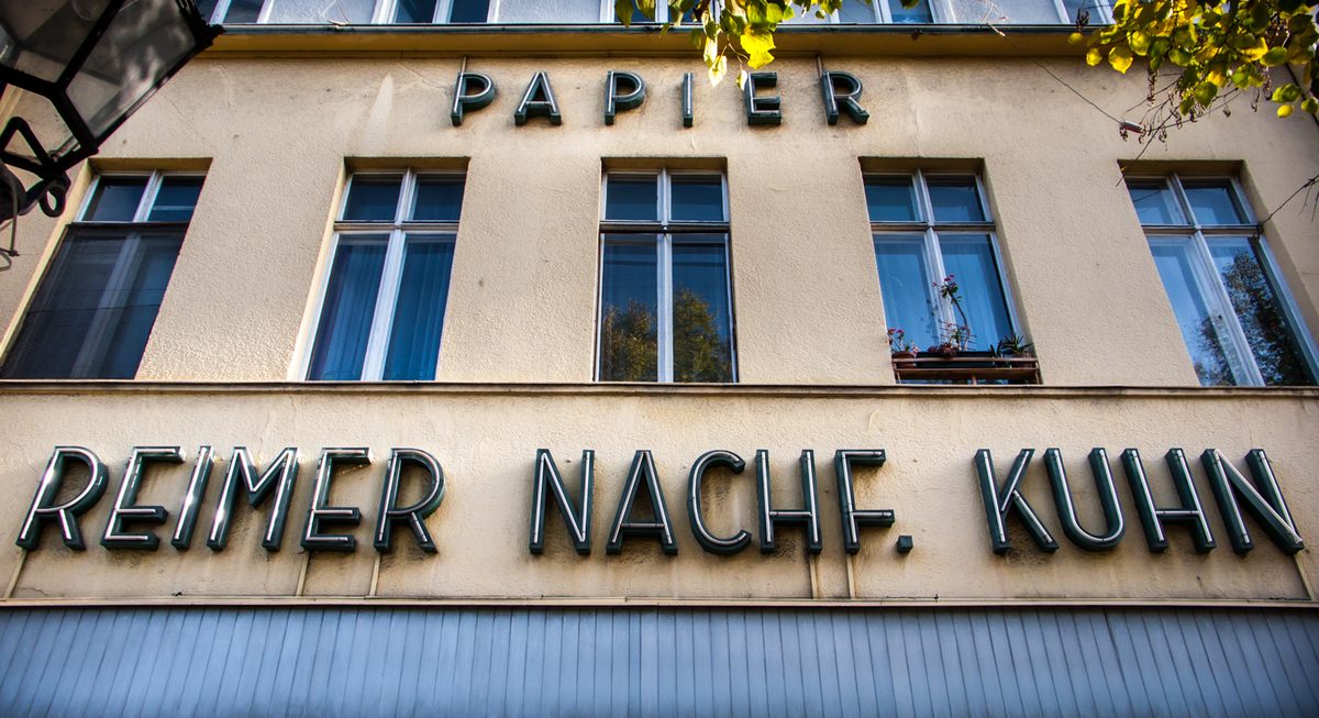
Papier. Four or five years ago this sign still lit up, casting a green glow onto the street at night. I haven’t seen it lit up for a while now, but the stationery shop just below it still exists. Presumably when it goes out of business or the owner retires the sign will disappear. It’s an elegant sign and I’ve included it here because it is one of my favorites, but the photo doesn’t really convey what makes it great. What makes it great–and this is almost impossible to photograph–is coming out of Mehringdamm U-Bahn station and this being the first thing you see. For a brief moment, it’s like you’ve come above ground into the past. Then you look around and there is nothing else on the street even remotely like it. Everything else is new, clean, and slightly bland, which somehow makes the sign seem even more magical and otherworldly.


Follow us on Twitter to get the latest on the world's hidden wonders.
Like us on Facebook to get the latest on the world's hidden wonders.
Follow us on Twitter Like us on Facebook