In A City Of Murals, The Simplest One Stands Out
The bright pink wall of this L.A. clothing store has become an Instagram icon.
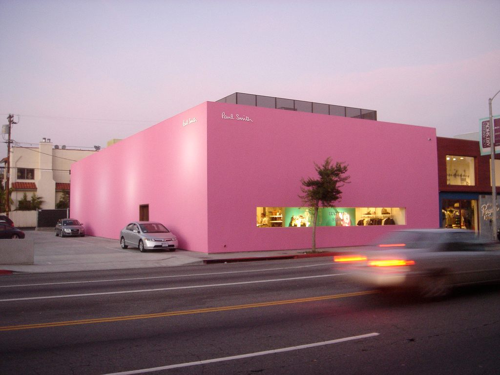
The candy-pink exterior of the Paul Smith Los Angeles store. (Photo: Richard Moross/CC BY 2.0)
When the British designer Paul Smith opened his Los Angeles location in 2005, the exterior of the new store received little more than a mention in most announcements. A New York Timesarticle noted that it was “painted pink to attract passing drivers,” but more attention was paid to the interior layout of the store than the bold, vivid paint job.
And yet this Paul Smith store, exclusively because of that paint, has become one of the most photographed places in one of the most photographed cities in the world.
A search for the store’s location on Instagram reveals that it’s being used as a backdrop for selfies and portraits almost constantly, with dozens of new uploads per day. (That’s only including the ones that are nice enough to tag themselves with the location.) The hashtag “#pinkwall” has over 19,000 images, with at least half being the wall in question. The Paul Smith wall makes the list of almost every available “most photographed locations in Los Angeles” list—it’s #4 on L.A. Weekly’s 10 Spots that have been “Instagrammed to death.”
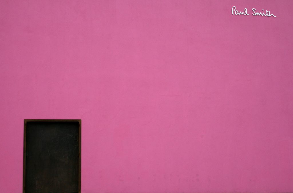
The side wall of the Los Angeles location. (Photo: Corey Harmon/CC BY-ND 2.0)
The Paul Smith wall isn’t among the most photographed places in Los Angeles because folks are boasting about having gone shopping there, or because the area is so well-trafficked (“There are no shops around it, pretty much,” says Southern California photographer Nicole Priest), or because it’s historic or culturally important or even, really, because people care about the store itself, which sells things priced far out of the reach of most consumers. (Representatives of the Paul Smith label declined my request for an interview, for some reason.)
Instead, the Paul Smith wall is photographed because it is among the most spectacularly well-suited places in the world to do something that only in the past couple of years has become an obsession for a world filled with smartphones and social media.
Everyone looks freaking great standing in front of it.
There are technological explanations that make the Paul Smith wall such an ideal spot for photography. “Bright colors like that typically work really well when you’re viewing photos in a small format, like on a phone, because they make things stand out,” says Stan Horaczek, a photographer and the online editor of Popular Photography and American Photo magazines. “You don’t have to examine them closely for them to catch your attention.” The color, which Horaczek says looks similar to this professional backdrop labeled as “tulip,” is unabashedly lovely: vivid, vibrant, pastel-enough to look delicate but red enough to be assertive. On a tiny phone screen? It pops like few other colors do.
The fact that the wall is a simple swath of color, unbroken and very, very tall, makes it curiously like a professional backdrop itself. In photographing outside, it’s near-impossible to get a uniform backdrop; a picture of someone on a beach will include sand and ocean and sky, for example. There’s nothing wrong with that, of course, but having a single unbroken background gives a photo a different, almost a professional or studio, feel.

British designer Paul Smith. (Photo: Liton Ali/CC BY 2.0)
It’s also a really easy place to take a great pic. “I think that wall, regardless of your level of photography, if you’re good or not, it’s easy to take a good photo in front of it,” says Priest. “Someone can go and take a picture of it without much thought.” The light, says Priest, is ideal for much of the time, either for complete shade or a cool, arty shadow. When the sun is high in the sky, says Horaczek, it’ll act like a single hard light source “that evenly illuminates the whole wall and creates harder shadows.” That creates a huge amount of contrast between the subject (i.e. “the person”) and the background, which, again, makes it a particularly eye-catching image, especially on a small screen. The shadows, too, can be fun to play with; many of the images captured at the Paul Smith wall are actually primarily of shadows, which look particularly dramatic on the wall.
The size of the wall, too, has an effect on its use as a photographic backdrop. “Negative space is a big trend right now, especially in portrait photography, where you make people look small in their environment,” says Horaczek. Most people don’t have access to huge single-tone backdrops, but it’s a cool look at the moment. The Paul Smith wall allows for people to use this trend, where normally it wouldn’t be possible or feasible.
None of this would really matter if there wasn’t such an incredible demand for self-portraits on social media. When the wall was painted in 2005, the iPhone didn’t exist, and social media was in its infancy. Methods for sharing photos were limited to art-focused services like Flickr. Facebook was still limited to only a few universities. The primary device used for taking pictures was, as weird as this sounds now, a dedicated camera. The years that followed introduced a device that can take and share photos instantly, a front-facing camera and the concept of the selfie, and a social media culture that values self-portraiture.
The Paul Smith wall is, with a single color, excellent lighting, and large size, technically ideal for certain kinds of photography, but we can’t undervalue the specific appeal of that color. Colors, weird as it sounds, go through trend cycles, and there is a specific palette that’s been in vogue on social media for the past few years. Pinterest, in its annual survey of the dominant colors in images posted on its site, ranked “blush pink” the color of the year for 2016. Pantone’s color of the year for 2016? “Rose quartz.” Neither of these are precisely the shade of pink on the Paul Smith wall, but they’re not far off. Pink, along with teal and mint shades of green (also on Pinterest’s most popular colors list), are hugely popular shades right now.
The Paul Smith wall isn’t the only popular wall in Los Angeles, but it is the most unusual. Others, like Colette Miller’s wings painting (various locations), are more prop-like; they’re designed for someone to stand in a specific place, so it looks like they have wings. The “Made In LA” sign, also on Melrose, spells out those words in gigantic letters, a much less subtle reminder to your social following of where you are. The murals of RETNA and Dallas Clayton are graffiti-inspired works that, when used as a backdrop, are closer to a shot of someone standing in a museum.
That big pink wall is something else: arty, but not exactly art; unbranded but instantly recognizable; off-the-beaten-path but hugely popular. More than anything, it is a totally unintentional power boost to the Instagram photographer. Taking a picture of yourself in front of the Paul Smith wall is a modern act, a culmination of advances in technology and changes in aesthetic preferences over the years. Plus, your hair looks really great in the smiling California sunshine.







Follow us on Twitter to get the latest on the world's hidden wonders.
Like us on Facebook to get the latest on the world's hidden wonders.
Follow us on Twitter Like us on Facebook