Is a ‘!’ Good For Your Brand? We Asked Some Experts
The “Jeb!” campaign logo goes back to 1994. (Photo: Public Domain/WikiCommons)
On Saturday February 20, presidential hopeful Jeb Bush suspended his campaign. The excitement was over, though most agree that there was little to begin with. Why, oh why, then, did he go by “Jeb!”?
Jeb’s exclamation-marked campaign logo became the brunt of a thousand jokes, a noiseless shout in bolded Baskerville. Since the logo was rolled out with very little context, the media narrative quickly concluded that it was Jeb’s attempt to overcompensate for his low energy—and for his last name.

“The exclamation point usually injects enthusiasm, a declaration, an exclamatory—so you’re supposed to read it like, ‘Wow! Great!’,” says Rob Frankel, a branding strategist. “With Jeb, it didn’t do what it was supposed to do, which was put a new shine on an old name, and to try to express novelty and freshness.”
Ed Roach, a Canadian corporate branding consultant, offers his perspective: “When I put an exclamation mark on a logo, it’s usually a little bit of playfulness; it takes the edge off, it’s a little friendlier, it’s light-hearted, is how I would look at it,” he says. “So from a politician’s perspective, it looks nice. I don’t know what they were trying to get across—‘cause Jeb is the polar opposite of an exclamation mark.”
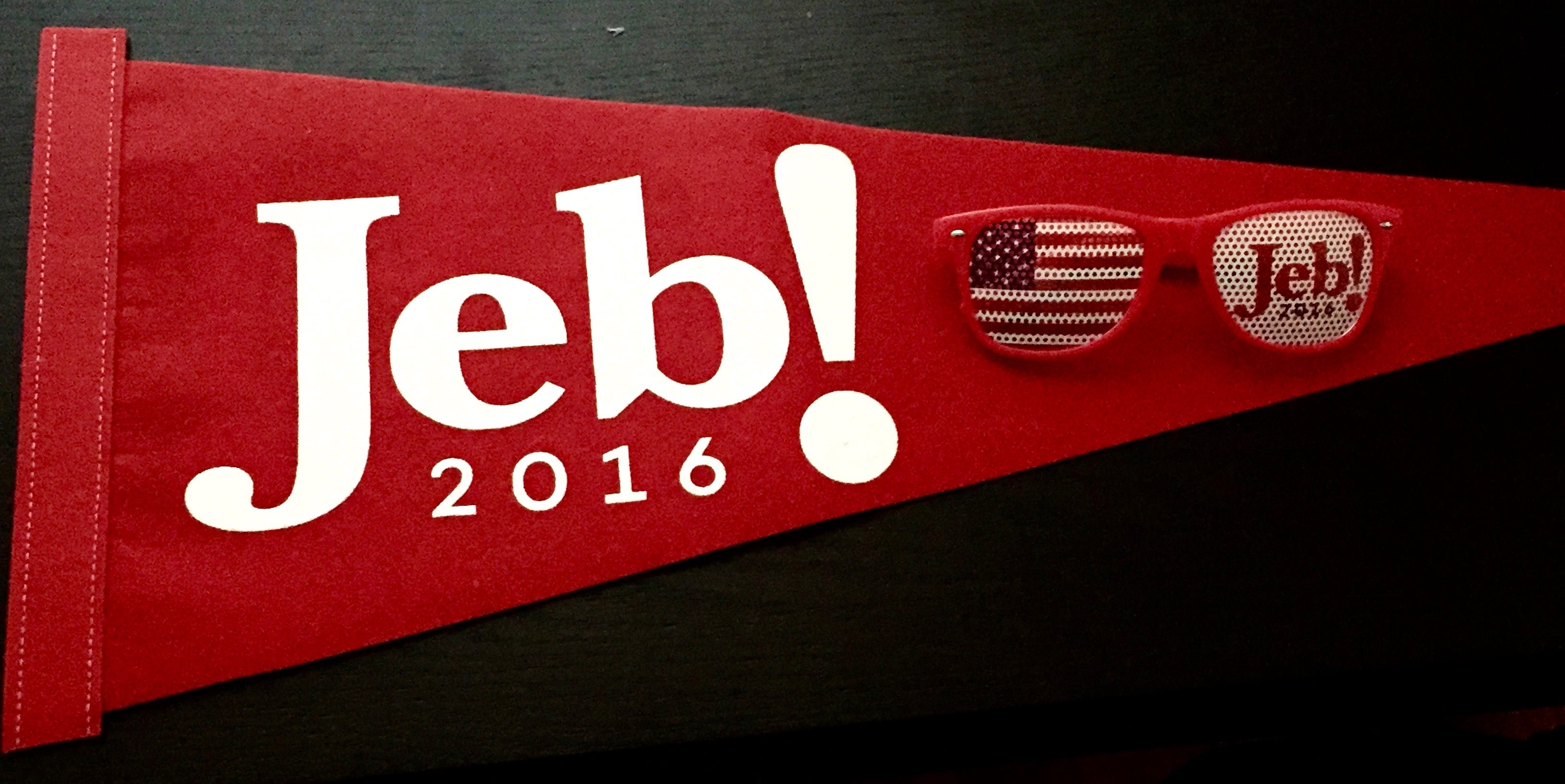
Jeb! Jeb! (Photo: Tao Tao Holmes/Atlas Obscura)
Jeb’s was not the first campaign to feature exclamatory punctuation. Lamar Alexander, a Tennessee senator, went by “Lamar!” in his run for the Republican presidential nomination in 1996 and 2000. But Bush is noteworthy for having used the Jeb! logo, complete with exclamation, since his first run for governor in 1994. That’s a long time to sustain a heightened level of enforced excitement.
The demise of Jeb!-the-brand leads to a broader question: How do exclamation-marked names fare among the public? Is a ”!” tacked onto a brand name the harbinger of its demise, or can people be riled up by corporation-mandated punctuation? Let’s examine the evidence.


Enough with the yodeling, already. (Photos: Public Domain/WikiCommons)
Struggling tech company Yahoo! is the first name that jumps to mind. Though legally “Yahoo Inc.,” the company logo has retained the “!,” a vestige from its early days. In 1994, it was founded as “Jerry and David’s guide to the World Wide Web,” then renamed a year later. (Fun fact: “YAHOO” stands for Yet Another Hierarchically Organized Oracle—though the founders say they chose it more for its slang connotations.)
As for Yahoo’s “!”? “Sheer naivety,” says Frankel. Yahoo! ”was born in the mid ’90s when nobody knew what they were doing on the internet, and you could do whatever you wanted to do.” The internet back in those early days was much more playful, he says. “You could have called it ‘Eureka! I found it!’ but they called it ‘Yahoo!’”
Like Jeb’s campaign, Yahoo! has been consistently teased for its over enthusiasm. In 2013 the company provided a detailed background explanation of its new logo, still featuring the exclamation point but tilted nine degrees, “just to add a bit of whimsy,” according to CEO Marissa Meyer. So far, no dice.
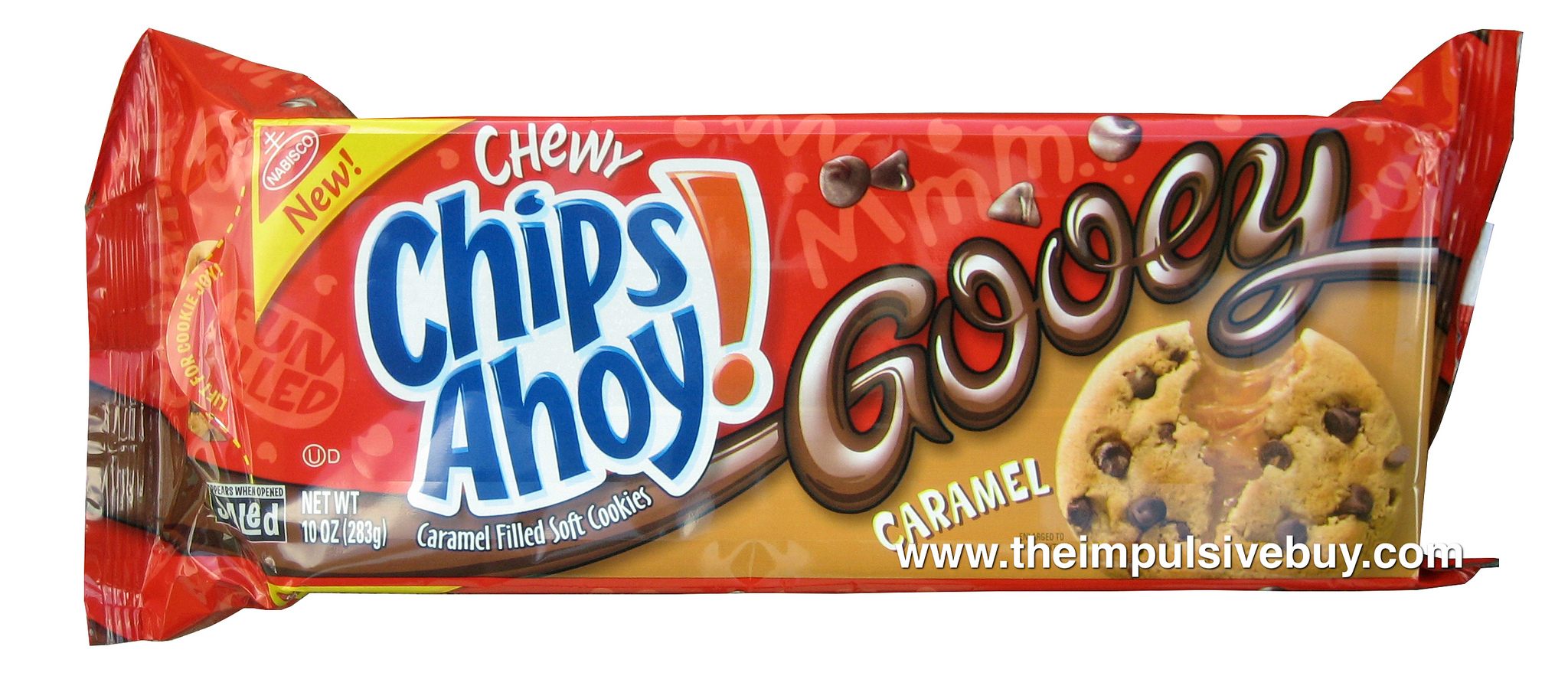
Now that’s something I can get excited about. (Photo: theimpulsivebuy/flickr)
How about food brands—or even better, food wordplay? Frankel explains that “Chips Ahoy!” plays off the phrase “Ship ahoy!,” hence the shouting. But hey, cookies—who isn’t excited about those?
Yum!, a holding company for KFC, Pizza Hut, and Taco Bell, also leverages an exclamation mark. However, without the pun, and without the promise of cookies, it somehow seems more unsavory, especially when you consider the antibiotics and other chemicals used in Yum!’s foodstuffs.
How about you let me decide how it tastes. (Photos: Public Domain/WikiCommons)
For a few smaller brands, there’s Joomla! (a tech company) and JOOP! (German clothing and cosmetics), which do or don’t resonate depending on your excitement levels for content management systems and eau de toilette. In Brazil, there’s television station RedeTV!, whose bombastic announcers seem worthy of the exclamation, and in the U.S. there’s E! Entertainment, which might be America’s most successful example of exclamatory branding. As for musical ensembles, there’s been “Bomb the Music Industry!” and “Panic! At the Disco,” the latter dropping its ! in 2008 and reinserting it after the band’s split one year later. (! drama.) There’s also a band that scrapped words altogether and went straight for “!!!” (pronounced Chk Chk Chk). Started in 1996, they are currently on tour. So maybe if you add enough exclamation, it’s a different equation.
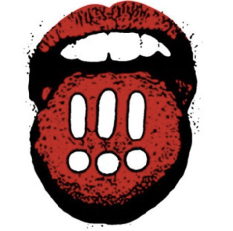
An album cover for the punk band !!! (pronounced Chk Chk Chk). (Photo: Screen shot)
As for certain town citizens, no time for the weary! Check out the towns of Hamilton! in Ohio, Westward Ho! in England, Saint-Louis-du-Ha!-Ha! in Quebec, and Ostrava!!! in the Czech Republic.
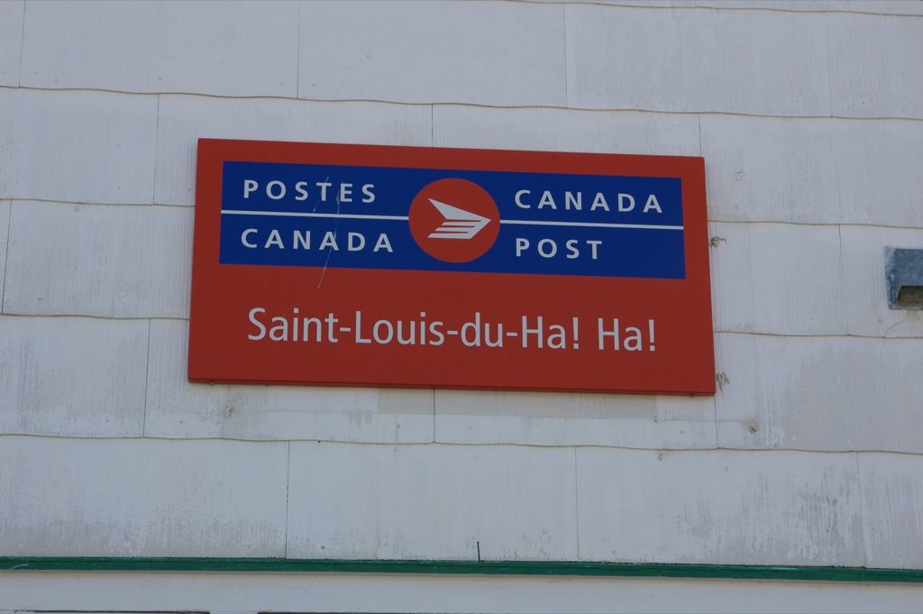
Must wonder how call center folks respond to that address. Saint-Louis-du-Hunh? (Photo: Rob Schmidt/Wikimedia Commons CC BY 2.0)
Steve Douglas, owner of the Logo Factory, which provides logo design & brand identity services, says that he doesn’t believe in exclamation marks and doesn’t think they resonate well, unless perhaps marketing towards a younger demographic. Similarly, Karen Post, author of Brand Turnaround, says that she really doesn’t think the addition or elimination of an exclamation point is going to be a significant game changer.

The Boise Public Library building is hard not to love. Because who doesn’t love books? (Photo: Google Maps screen shot)
And as branding experts will tell you, a logo can only do so much. It’s the brand and the product that matter at the end of the day. People don’t need to be told to be excited when what you’re offering is inherently awesome.
Gastro Obscura covers the world’s most wondrous food and drink.
Sign up for our regular newsletter.




Follow us on Twitter to get the latest on the world's hidden wonders.
Like us on Facebook to get the latest on the world's hidden wonders.
Follow us on Twitter Like us on Facebook