For Centuries, Readers Annotated Books With Tiny Drawings of Hands
They were the medieval version of a highlighter.
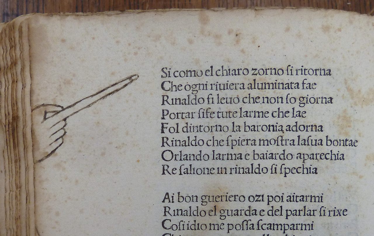
In the list of rarely-used punctuation marks—amid the interrobang (‽), hedera (❧), lozenge (◊), and asterism (⁂)—the manicule is a pointedly unique symbol. Quite literally: it takes the form of a hand with an outstretched index figure, gesturing towards a particularly pertinent piece of text.
Although manicules are still visible today in old signage and retro décor, their heyday was in medieval and Renaissance Europe.
Despite its centuries-long popularity, the first-ever use of a manicule is surprisingly difficult to pinpoint. They were reportedly used in the Domesday Book of 1086, a record of land ownership in England and Wales, but widespread use began around the 12th century. The name comes from the latin word manicula—little hand—but the punctuation mark has had other synonyms, including bishop’s fist, pointing hand, digit, and fist.
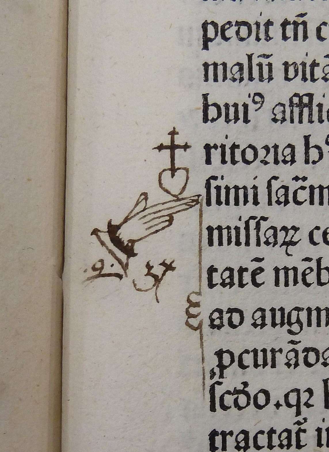
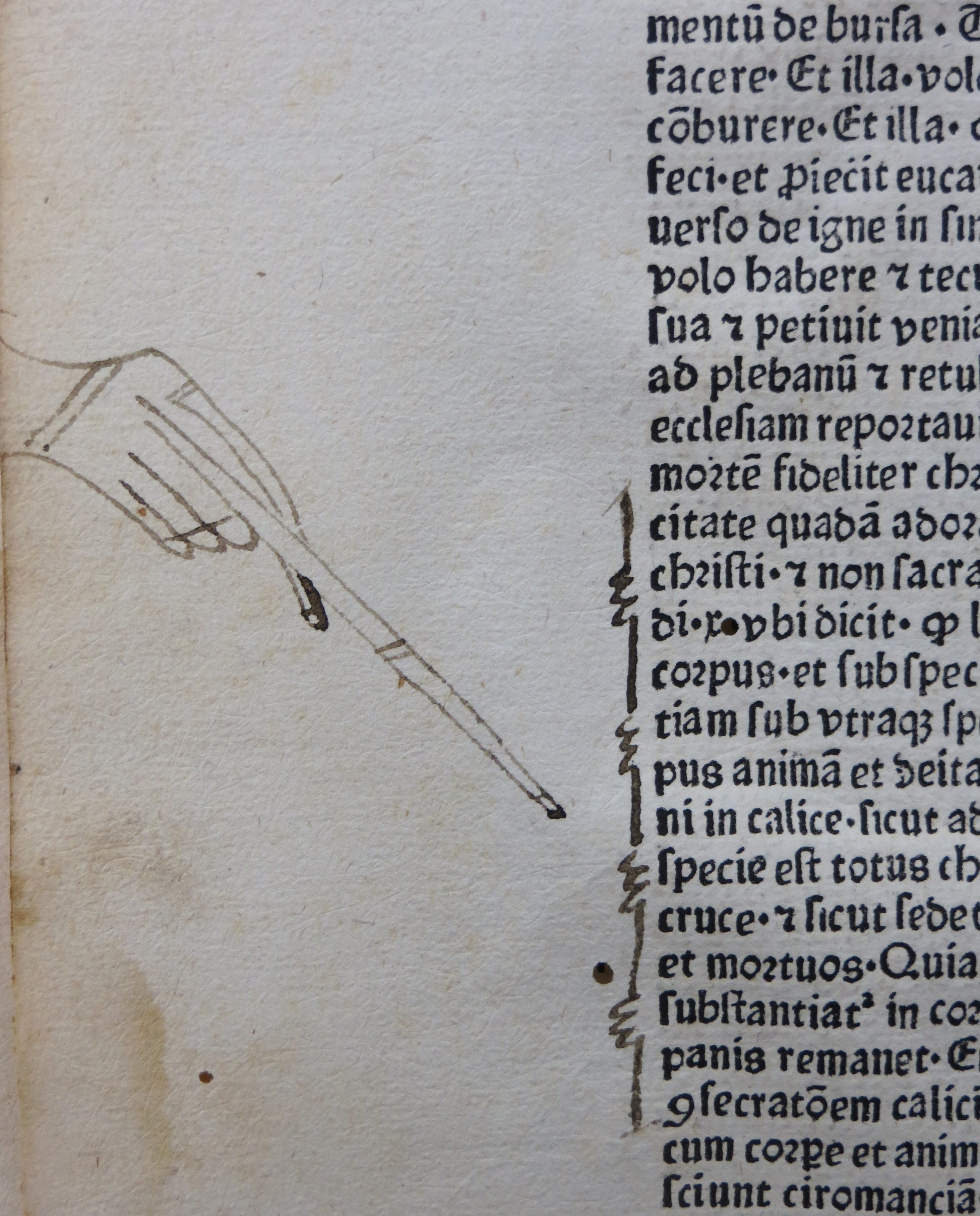
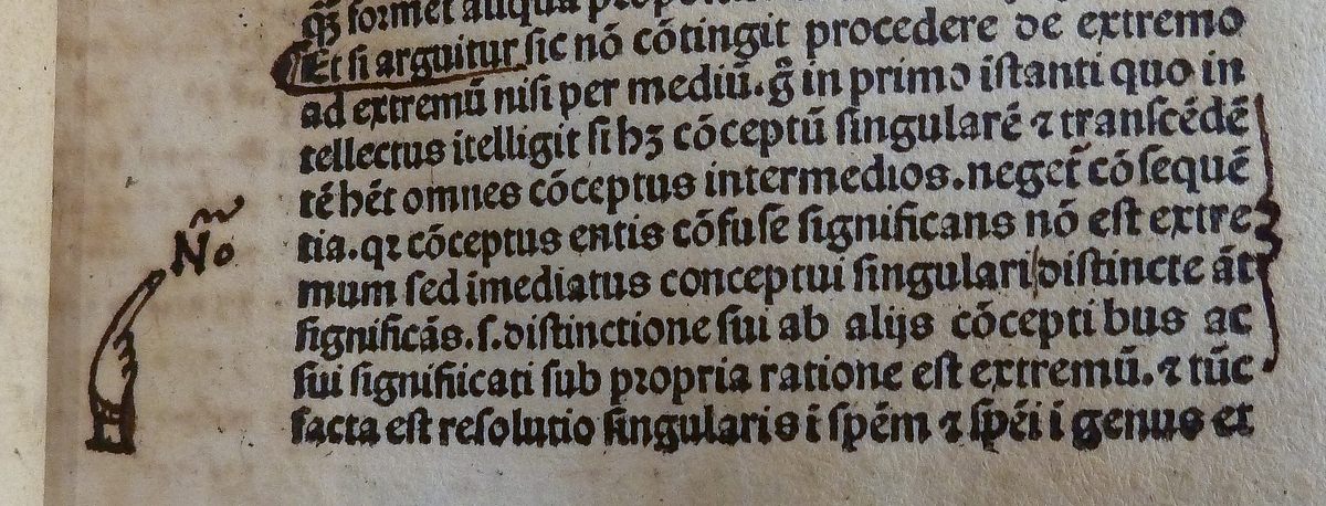
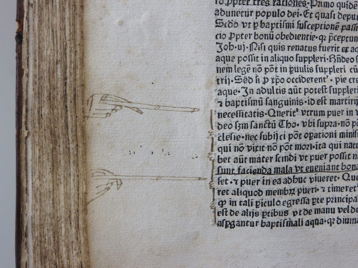
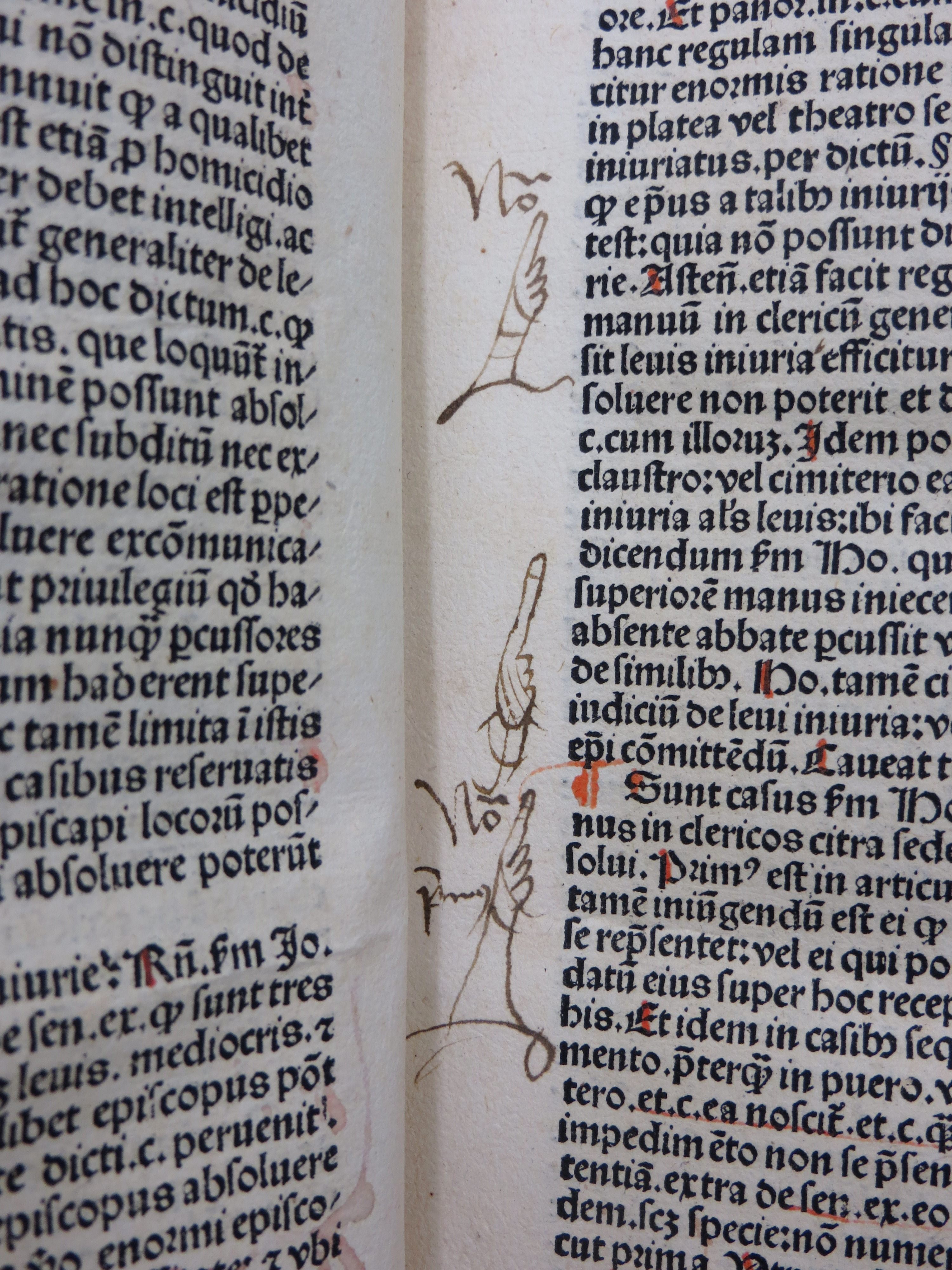
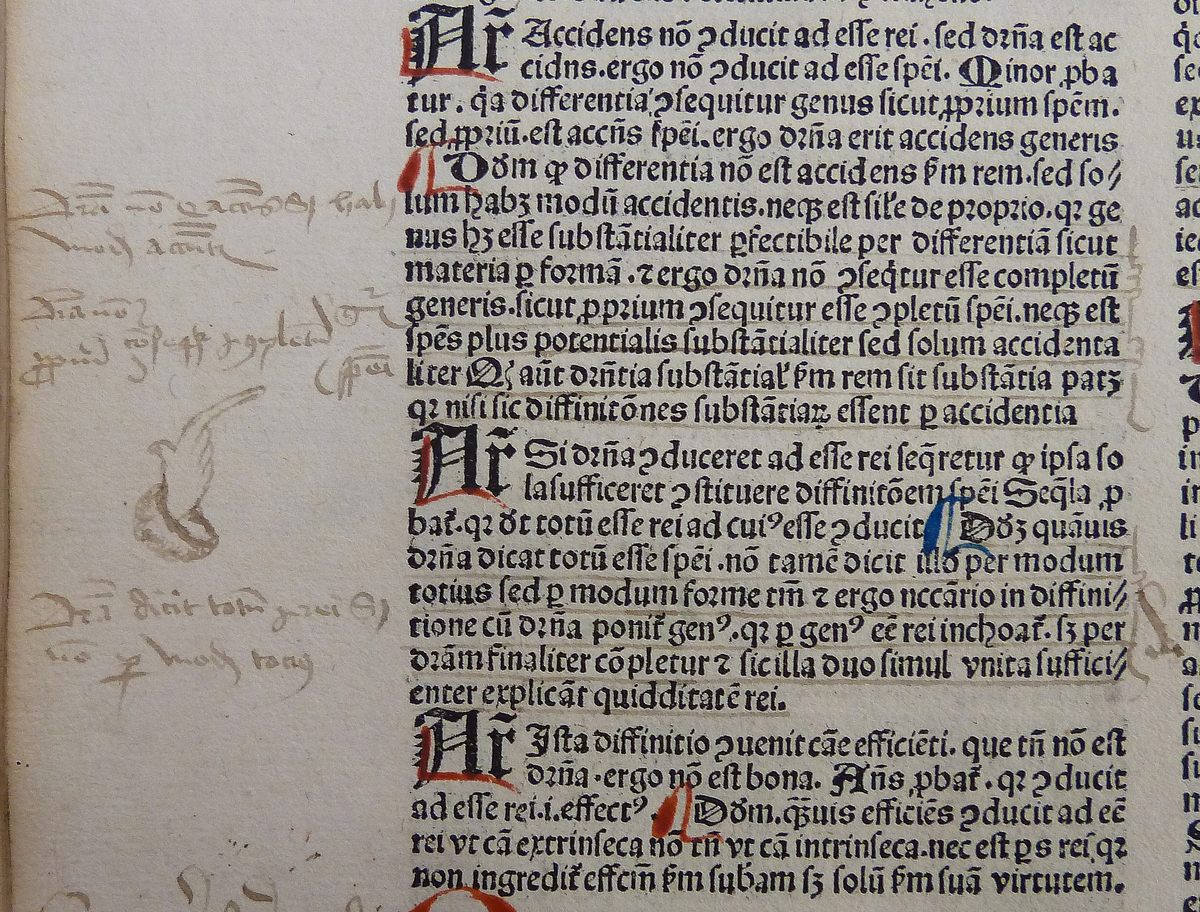
As far as punctuation marks go, the manicule’s function was fairly self-explanatory. Usually drawn in the margin of a page (and sometimes between columns of text or sentences), it was a way for the reader to note a particularly significant paragraph of text. They were essentially the medieval version of a highlighter. Although mainly used by readers, occasionally a scribe or a printer would draw a manicule to indicate a new section in a book.
The use and dynamic of manicules changed once books began to be printed. This new technology allowed writers and publishers to highlight what they believed to be significant. As Keith Houston notes in his book Shady Characters: The Secret Life of Punctuation, Symbols and Other Typographical Marks, “the margin, once the reader’s workspace and sketchbook, was gradually colonized by writers seeking to provide their own explanatory notes or commentaries.”
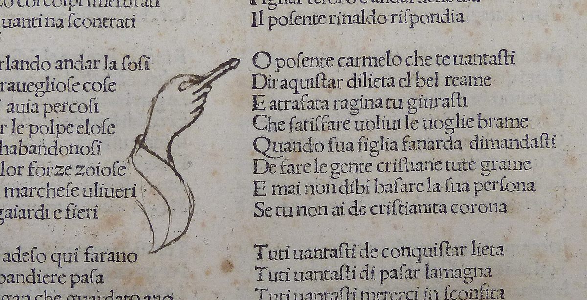
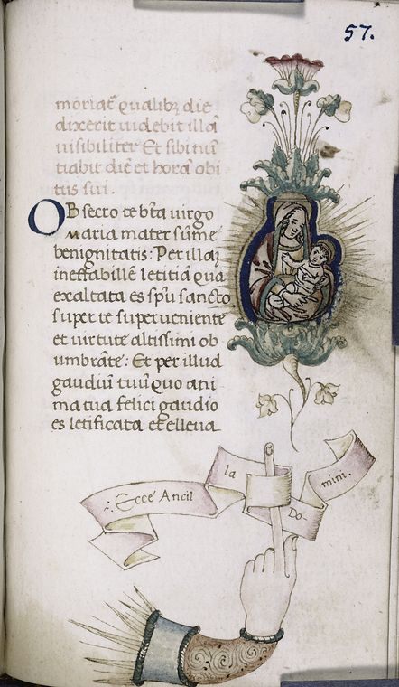
Despite its simplicity, the style of the manicule could vary. Some had elaborate sleeves, some were strangely proportioned with extra-long fingers, as the one leading this article, and some were otherwise anatomically incorrect. The Italian Renaissance scholar Petrarch drew manicules that consisted of five fingers and no thumb, which is surprising, seeing as he would have been looking at the very thing he was drawing. (A five-fingered hand, it’s worth noting, would not have been the strangest thing to adorn the margins of a Medieval manuscript).
In the 19th century, manicules had moved beyond books and into signage, advertisements, and posters as a way of directing the eye. They pointed the way to trains and pubs. In the “Wanted” poster for John Wilkes Booth following his assassination of President Lincoln, a manicule gestured towards the reward announcement. Manicules were even used on gravestones (pointing up toward heaven, of course).

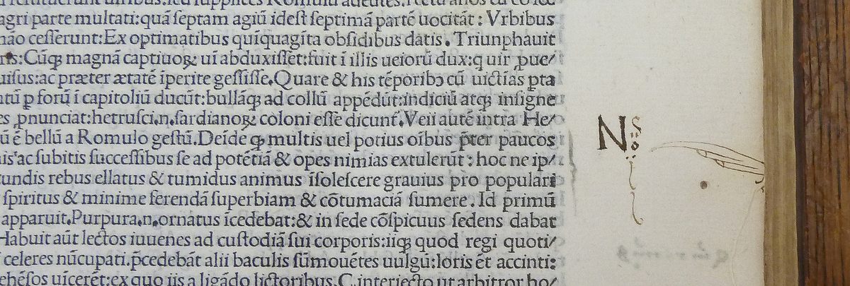
While the popularity of manicules faded before the arrival of the 20th century, they aren’t completely extinct. A mutated version existed in early versions of the cursor, in the form of an upwards-pointing clenched fist. There are manicule emojis that point left, right, up and down. If you look hard enough, you can even find one in the Wingdings font. ☞ Scroll on for more manicules.









Follow us on Twitter to get the latest on the world's hidden wonders.
Like us on Facebook to get the latest on the world's hidden wonders.
Follow us on Twitter Like us on Facebook