Get Hypnotized By This Interactive Map of the Winds
Using live meteorological data, it shows every wave and gust on the planet.
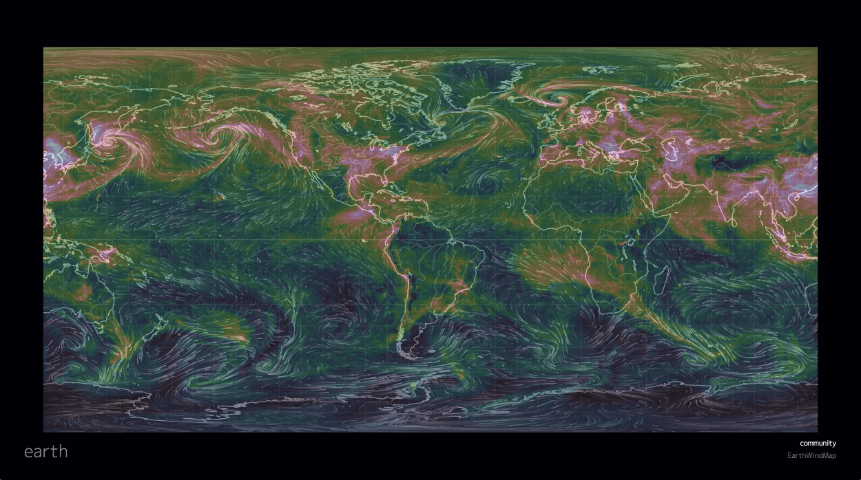
What a lovely map of all the particles in the air. (Photo: All images from the Earth wind map. Screenshots by Eric Grundhauser)
While the elegance of hand-crafted old maps is self-evident, finding beauty in modern satellite maps is a bit more challenging. Thankfully we have visionary modern mapmakers like Cameron Beccario who created the Earth wind map. Don’t let the understated title fool you—his creation is one of the most mesmerizing interactive maps ever made.
Inspired by an earlier, also lovely, map of the wind currents in the United States, Beccario created his robust global tracking map in 2013. Using data from the Global Forecast System, which updates every three hours, the Earth wind map is able to show all of the wind currents across the globe in almost real-time. The information is displayed as a swirling, flowing stream of green lines that get brighter the faster the wind is blowing. The effect is an irresistibly hypnotic look at the invisible forces covering the globe.


The winds swirling around South America.
Want to know how windy it is in China right now? See a tornado warning and want more accurate data? Trying to find the windiest place on the planet? Double clicking a spot anywhere on the globe will pinpoint the spot to its latitude and longitude, and tell you how strong the wind is there. The elevation of the wind information can also be changed so that you can get on-the-ground map data, as well as look at what’s going on in the stratosphere.
It’s not just the wind that the map can track. The control panel can show other meteorological data. Click on the “Ocean” display and the world’s landmasses will go dark, but every wave in the ocean will be shown coursing over the waters. There are also options to look at the amount of chemicals (aerosols and sulfates) and particulates in the air. Each of these other views changes the patterns of swirls and whorls that move over the map. Where the wind map is a neon green and blue system, the chemical chart turns into an earthy pink and green display. The chemical and particle views are informed with near-live information from places like the National Oceanic and Atmospheric Administration and NASA.

The chemicals over Southeast Asia.
While the default display of the map is a 3D globe, it can also be displayed in a number of more traditional formats including in an equirectangular setting and as a Winkel Tripel projection. Really no matter how you prefer to look at the maps, the waves and winds end up forming a stunning image of our world.

The wave activity at the South Pole.
Years after creating the map, Beccario continues to make tweaks and improvements like adding navigational hot keys, and spotlighting particular storms on the project’s Facebook page. No matter which way the wind blows, the Earth wind map is one of our most lovely modern maps.
Map Monday highlights interesting and unusual cartographic pursuits from around the world and through time. Read more Map Monday posts.






Follow us on Twitter to get the latest on the world's hidden wonders.
Like us on Facebook to get the latest on the world's hidden wonders.
Follow us on Twitter Like us on Facebook