How Beige Took Over American Homes
In the early 2000s, the mortgage crisis and HGTV gave us a new use for our houses: flipping them.
When I was in middle school, my parents renovated our family home. The house, an unpretentious 1,844 square-foot one-story traditional—a rather minimal house with a front facing garage, one cross-gable, and a miniature porch—was originally built in 1996, and the fads of the ‘90s were not aging well.
The 2006 renovation was technically the second one. Old photographs show a home that was entirely white, with the exception of the wallpaper in the kitchen and hall bathroom. In the first few years my family lived in the house, it shed its sterile white skin in favor of salmon pink—the color that genuinely reflected on the places my Texas-loving parents had lived before—their personal history, if you will. The walls were festooned with pictures of chili peppers, the sofa awash in geometric shapes in navy and red. Overall, you could call the style “southwestern”.
Although these details are tacky by today’s standards, there was a vibrancy in every room, which made the house seem alive. People lived there—people with their own lives, pasts, and tastes, each reflected in some way on and between the walls of their home.
In 2006, everything was painted beige.

Beige, or beige? (Photo: severija/shutterstock.com)
The living room furniture was sent off to be reupholstered—beige with red flowers, beige with red plaid. My parents sold the great leather armchair and the coffee table. The wallpaper in the kitchen disappeared, swallowed up by the beige. The countertops became granite; the linoleum floor became stone tile; the screen porch became my dad’s beige office, and the wallpaper borders became crown molding. The white carpet transformed into light-colored wood. The painting of the cowboys over the fireplace became the flat-screened TV.
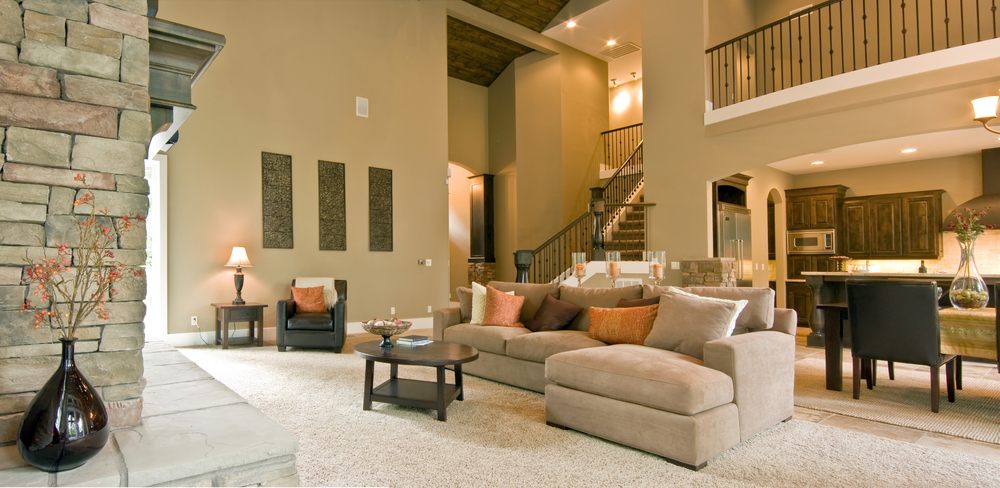
But why beige? Why was interior design in the 2000s so mind-numbingly mundane? Who or what is responsible for this nationwide obsession with dull neutrality? With its coordinating furniture sets, “Tuscan” flair, and an overall preoccupation with cheap icons of luxury on a beige background, interior design in the 2000s is an interesting period to study simply because there was absolutely nothing interesting about it at all.
The culprits are different, but related: the economics of the mortgage crisis and the rise of home-improvement network TV and how they changed the American perception and concept of home over the last few decades.

Charting the history of home improvement TV. (Photo: Courtesy Kate Riley)
A combination of deregulatory economics, a heavily commercialized and materialistic culture, and the public thirst for excess post-‘70s energy crisis made the ‘80s a perfect time for conspicuous consumption. During this decade, a heavy emphasis was placed on luxury and the display of personal wealth, which, of course, was reflected in our houses. Mixing this shiny new materialistic culture with the economic reforms of the 1990s created a perfect storm for a housing bubble to form in the early 2000s.
In the 1990s, the Clinton Administration pushed for huge mortgage reforms in order to stimulate growth in the home-building sector and provide more housing for lower-income Americans. Combine these with tax relief acts, the repeal of Glass-Steagall (the barrier between investment and commercial banks), and the relaxation of oversight on exotic financial commodities, and you get a bunch of people pushing loans on a bunch of other people to buy houses.
We all know this story. But how does it relate to beige?
The point is a bunch of people were buying and selling houses. In order to keep up with the Joneses, home sales grew dramatically during the period between 1973 and 2009. Conveniently, at this time, new media swooped in and put everyday American houses on TV.
When HGTV debuted in 1994, it was mostly devoted to home improvement and simple crafts. But then came the overnight sensation of House Hunters in 1999. Although HGTV was not the first home improvement or interior design network, it was the first to make realty into a reality show. The national home-buying and home-selling fervor had finally hit the big screen. Capitalizing on the drama of making a huge financial decision, HGTV focused most of its attention on the theme of buying or selling a house, with shows such as Designed to Sell, House Hunters, Love It or List It, Flip or Flop, Property Virgins, and Buy Me becoming huge hits.
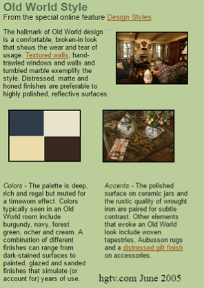
From hgtv.com, “Old World Style”. (Photo: Courtesy Kate Riley)
These shows were focused on renovating or redecorating houses in order to make them more appealing to potential buyers. Most of these programs (and other interior design programs on the network) featured sidebars where performing certain home improvement acts such as adding crown molding, a double sink, wood floors, and yes, neutral paint colors would add hundreds and thousands of dollars to a home’s equity. (How these calculations came to exist is beyond me.) Building an addition, updating appliances or HVAC systems, and performing repairs on a home’s roof, insulation, or other structural properties does in fact add a great deal of value to a home’s equity. Replacing the linoleum floor with slate, painting the house beige, and adding crown molding is arguably negligible in what determines a house’s true value when it comes time to refinance—but these became standard “improvements.”
Yet, constantly, HGTV threw around dollar signs at every corner on their interior design shows, and the American public ate this up. Interior design on HGTV had a dollar number attached to it, and people believed it even if they had no intention whatsoever to sell their home. The message was clear: decorating your home this way will make it more valuable. This accounted for why neutrality and HGTV dominated design at the consumer level from 1999-2009, and, in some form, even today.

From HGTV’s 2005 “Dream Home”. (Photo: Courtesy HGTV.com)
People, even those not selling their houses, painted their houses beige by the boatload, invested in icons of home luxury (granite countertops, stone and wood floors, sybaritic bathrooms, and European-themed furniture and décor), and made their houses virtually identical. Why? Because the TV said we were making money on our houses by doing these things.
So the beige-faux-European-complex prevailed supreme above other forms of interior design of the time, such as those practiced by publications like Architectural Digest or House Beautiful. Never were the names of architects or famous designers mentioned on HGTV. Our houses lost their personal worth and touches; they were worth to us only as much as they were worth to others. Our houses were painted beige because beige enabled the prospective buyers we (even unintentionally) were designing for to picture their own lives in our houses. Beige is a blank slate – a canvas upon which anyone’s personality can be painted over. The irony is that beige became the painting itself, because of the media-driven trend towards overwhelming interior neutrality, spurred by the idea that it added concrete value to our asset-houses.

Lists of available mortgages in February 2005. (Photo: Kate Riley)
Beigeification was part of a larger shift that happened during the early 2000s. After centuries of the home being primarily a place or a space, during the 2000s it was seen as primarily an object or, more specifically, an asset. At a time where mortgage speculation made our houses disposable and impermanent, beige slipped happily onto the walls of millions of Americans, who wanted easy ways to make their house “worth more” at the behest of HGTV and other media, who treated the home as a thing to be changed, or disposed of on a whim. Beige was not a harbinger of the clinical, minimal design that is so popular now; it was the harbinger of a bubble. When houses stopped selling, our design aesthetics immediately changed, streamlined by a tight wallet.
The age of IKEA was upon us.

From HGTV’s 2006 “Dream Home”. (Photo: Courtesy HGTV.com)
If the economic crash had any silver lining, it might be that beige became to lose its appeal after 2008. It’s cheaper post-recession to buy one piece of furniture than a set, and as the 2000s purchases began to fall apart, people began to realize that it was smarter in the long run to invest in fine quality merchandise. The mixture of architect-designed furniture with other novelty pieces, the revival of the accent wall and the belief that the home is truly a reflection of one’s personality were the views of a generation that had suffered through a lot of beige.
And what life lesson did beigeification teach us, if anything?
As my parents found out during their 2010 refinancing: Don’t believe everything you see on TV.










Follow us on Twitter to get the latest on the world's hidden wonders.
Like us on Facebook to get the latest on the world's hidden wonders.
Follow us on Twitter Like us on Facebook