The Visual Influences Behind Wes Anderson’s ‘Isle of Dogs’
Real-world landscapes played a role in shaping Trash Island.
How do you make a pile of trash look artful? From New York’s Treasures in the Trash Collection to the artists-in-residence at the San Francisco dump, people have found all sorts of ways to find beauty and meaning in garbage. For Wes Anderson’s upcoming animated film Isle of Dogs, which takes place largely on an island of trash, the production looked to a diverse array of real-world inspirations to bring a sense of order to its garbage. As it turned out, melding the chaos of detritus with Anderson’s famously ordered aesthetic was no simple task. Mild spoilers ahead!
“That was one of the things that intrigued me from the very start. Knowing Wes’s aesthetic, I thought it was an interesting choice to have two-thirds of the film actually take place on a trash heap,” says Paul Harrod, one of the film’s production designers. Harrod took over the project from Adam Stockhausen, and led the design and creation of the film’s main location, Trash Island, to its finished look in the film.
Isle of Dogs takes place in a semi-future Japan. “The tone we were always going for was ‘20 years in the future,’” says Harrod. “But it’s not 20 years in our future, it’s more like 20 years from about 1964.” In this future, all of the dogs have been exiled to an offshore landfill—Trash Island. When a young boy escapes to the island to find his pet, a pack of scruffy, celebrity-voiced dogs escort him on his journey across the island’s various regions. From color-coded garbage zones to a crumbling animal testing facility, Trash Island has a number of intricately crafted locations.

Much of the overall look of the film was inspired by the films of Japanese masters like Akira Kurosawa, as well as traditional Japanese ukiyo-e art. Produced throughout the 17th, 18th, and 19th centuries, ukiyo-e art tends to be defined by its framed tableau look, a design trait that has come to define many of Anderson’s films. “[It’s] the idea of taking these very pastoral landscapes from 19th-century Japan, and applying a different surface to them,” says Harrod.
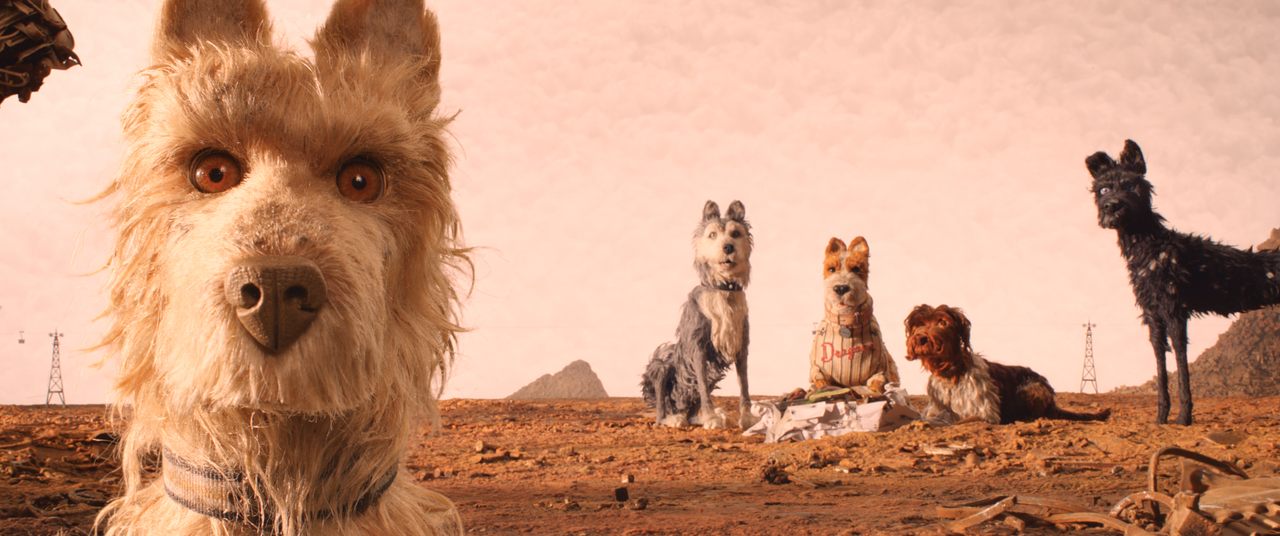
For the look of the trash heaps themselves, the production took cues from photographers such as Edward Burtynsky and Chris Jordan, and their images of staggering collections of trash. “[They] have been documenting the crisis of trash we are facing right now, how there already exists these vast landscapes of trash,” says Harrod. One aspect of such images that heavily influenced the look of Trash Island was that collections of trash often take on a specific color.
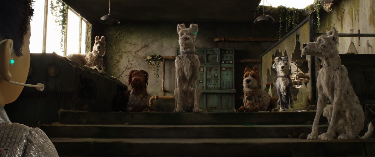
“The first scene when we’re introduced to the hero pack, the five main dogs, Chief, Rex, Duke, King, [and Boss], that was going to be a very rust-toned place,” says Harrod, “as though this is where all of the ferrous metals had been dumped. We looked at things like strip mines where the ground would be saturated with copper tailings and things like that.”
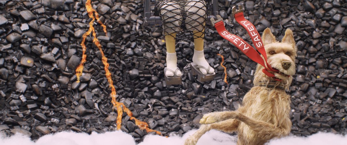
According to Harrod, a number of the early Trash Island locations were similarly conceived. “When [the character] Spots is first dropped on Trash Island, he’s in this sort of amphitheater of cubed metal. But it isn’t rusted, so it has this silver-blue hue to it. All of the cubes are going up into the sky, creating a kind of formalist background. Sublime, yet horrifying,” he says. “There’s a scene where they fight the dog catchers and we decided that that would be a totally black landscape, and the best way to create this was to compose it entirely of old car batteries and cathode ray tubes.”
Beyond their unifying colors, each trash zone contains its own hidden details. Internally, many of the unnamed trash zones in the film were given names based on the action that would take place there. There’s “Spots’ Landing,” and the all-black “Drone Beach.” There’s also a setting they called “The Crash Site,” composed of countless pieces of discarded paper. “We wanted it to be covered in newspapers, and it created this sort of beach, because that location is essentially a beach, being a relatively soft surface,” Harrod says. Many of the newspapers seen in the film include real articles that have been translated into Japanese, a detail that’s easy to miss.
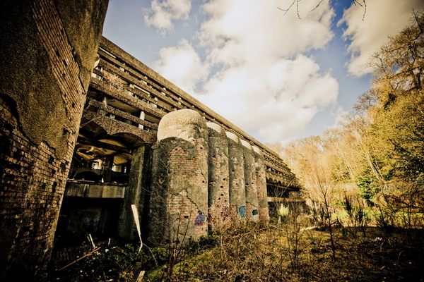
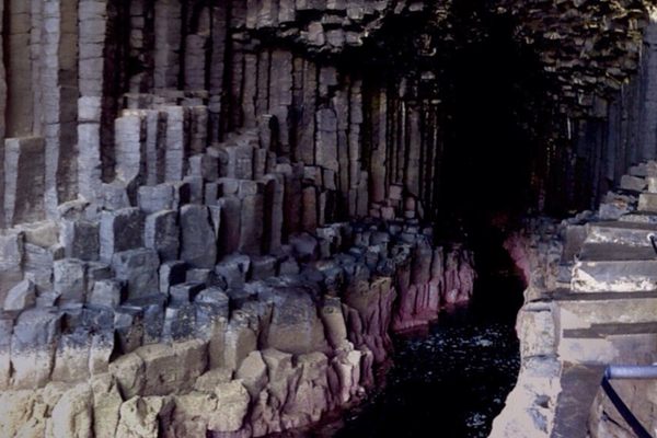
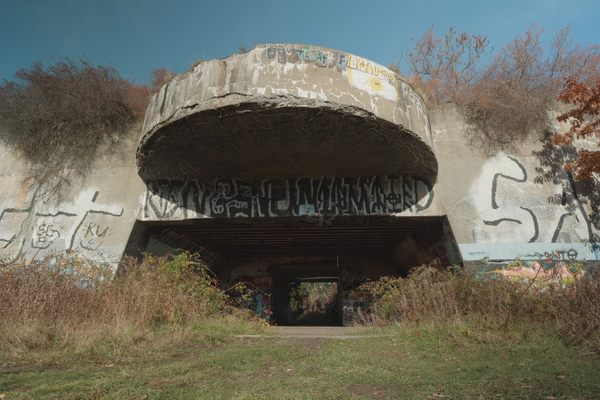
The designers looked to specific real-world locations for inspiration as well. For instance, the geography of the island itself was modeled in part on Western Australia’s Horizontal Falls. “It’s this remarkable set of channels where there are hills cutting through the water [placing] the water itself at different levels,” says Harrod. A portion of the film that takes place in a crumbling amusement park was inspired by the old rooftop amusement parks of Japanese department stores. The abandoned animal testing facility from another part of the island was based on locations including the old St Peter’s Seminary in Cardross, Scotland, and an abandoned winery in Paris.
Thanks to its myriad real-world influences, Trash Island feels both fantastical and satisfyingly alive. It also manages to fit within Anderson’s ordered, hermetically sealed universe. “Sometimes he would really surprise you and really bring more chaos into the image,” says Harrod. “When you start to see how he’s cutting things together and structuring the narrative, what felt chaotic becomes quite structural.” The Isle of Dogs might be made of garbage, but that doesn’t mean it’s messy.













Follow us on Twitter to get the latest on the world's hidden wonders.
Like us on Facebook to get the latest on the world's hidden wonders.
Follow us on Twitter Like us on Facebook